
Yankee Candle: Well Living Collection
Creative Direction, Graphic Design, Production

About the Project
During my time at Newell Brands, I had the opportunity to concept and design the Well Living Collection for Yankee Candle, a wellness-inspired fragrance line focused on mindfulness and intentional living.
The ask was to develop a distinct visual identity for Yankee Candle’s first wellness-focused line, created to appeal to consumers seeking calm, clarity, and balance in their everyday routines.
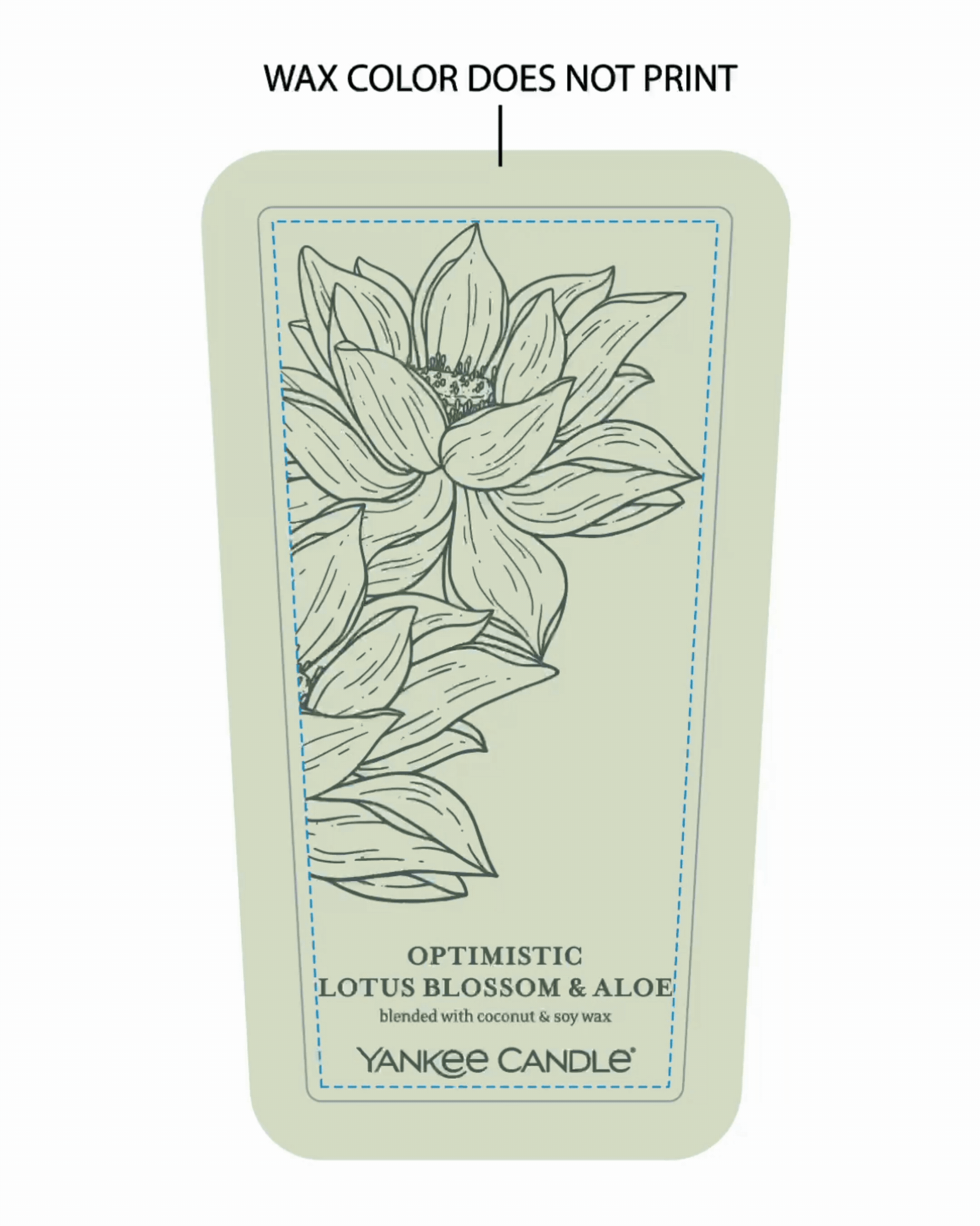
I developed the visual identity and led design execution across packaging, photography, and art direction. From custom botanical illustrations to a calming palette and minimalist layout, every detail was crafted to reflect serenity and clarity for the wellness-conscious shopper.
Key Deliverables: Visual identity, packaging (candles, wax melts, diffusers and essential oils), photography, ecommerce and POS visuals.
Client: Yankee Candle
Project Type: Brand Development & Packaging Design
Role: Creative Director, Art Director, Production Designer
Tools: Adobe Creative Suite, KeyShot
Additional Credits
Co-Directors: Brittany Rogers & Sarah Monfore
Photography: Newell Brands - South Deerfield Studio
^and many more hard workers!

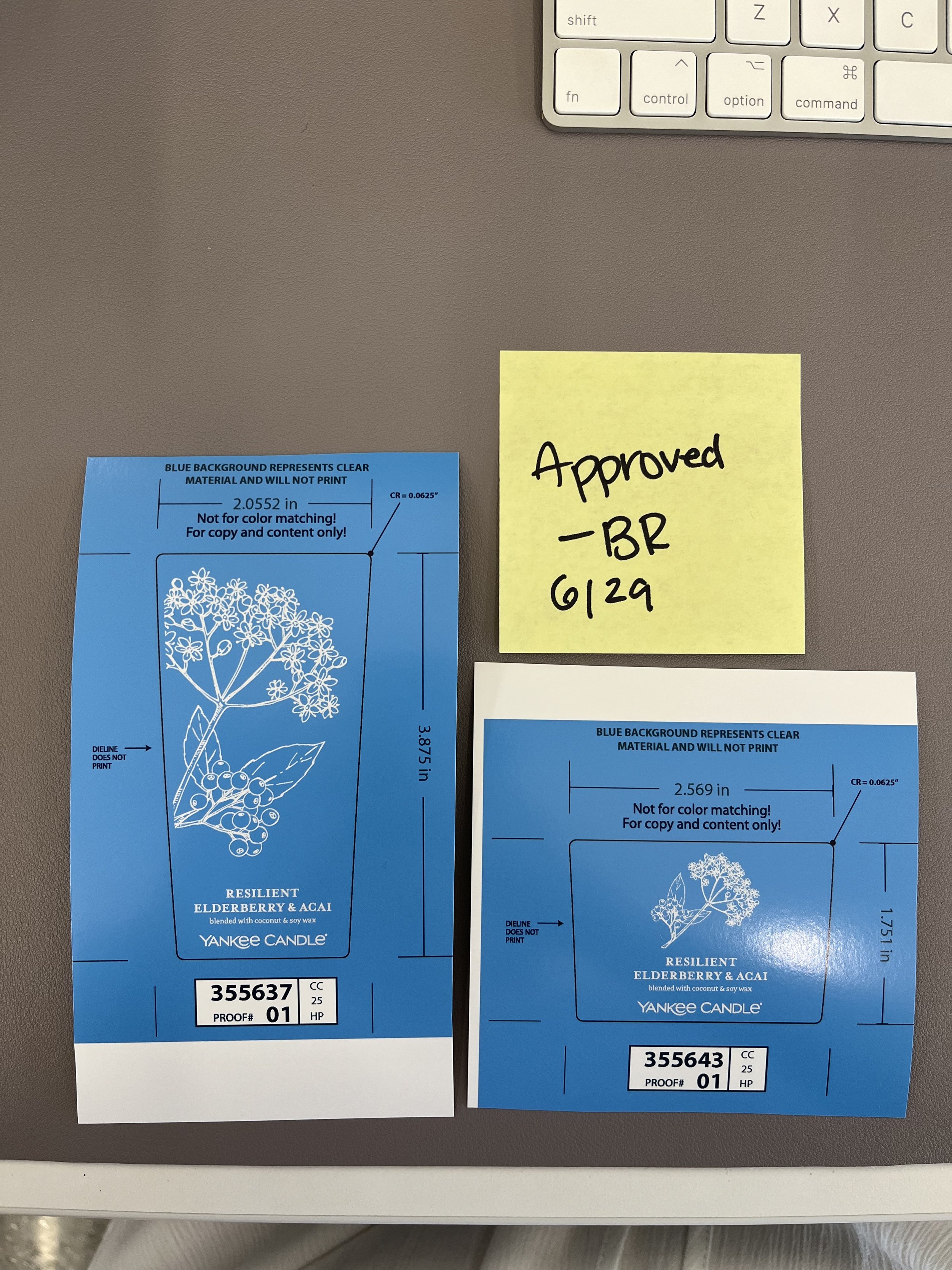
Behind the Scenes: Print Production
Bringing the Well Living Collection to life meant getting hands-on with every detail of production. I worked closely with our print vendors to review in-hand samples and ensure that the Pantone colors we selected looked just as intentional on glass as they did on screen. Each color was tested against the wax fill to make sure it remained legible, balanced, and true to the calming aesthetic of the line.
I also reviewed and adjusted the opaque white ink layer printed beneath each label, a subtle but important step to boost brightness and contrast, especially on more translucent wax tones.
Another key part of the process was testing the inner lid stickers. I checked for fit, clarity, adhesion, and how they interacted with the natural wood grain of the lids. Everything from label placement to finish and print alignment was fine-tuned across rounds, with physical samples lined up for side-by-side comparisons and sign off.
It was a true test of design meeting execution, making sure every material, ink, and surface worked in harmony across the full product line.


In Store Activation
As part of a full 360 campaign, the Well Living Collection came to life in stores through endcaps, table displays, and branded signage at major retail partners. While I did not design the in-store marketing materials, the packaging and visual brand language I developed were extended across the entire consumer journey. From shelf presence to supporting displays, every touchpoint worked together to tell a cohesive story rooted in calm, clarity, and well-being.


Photography shown is property of Newell Brands. All rights reserved.